UX of a Wine Glass
There’s a study that shows that people report that wine tastes better out of fancy crystal wine glass. Poor winemakers toil away in the mud, consulting the phases of the moon, to bottle a more excellent vintage than the last. Who knew all they need do is order up a box of Riedel stems.
Your product is not so different from that bottle of wine. A good visual design will enhance the experience of using your product. The visual design will indicate what sort of this this is, who the product is for, how much it costs, etc. Note that it indicates this whether or not you want it to. Serving Châteauneuf du Pape in a paper cup may not be an intentional choice, it will affect the experience of drinking it nonetheless.
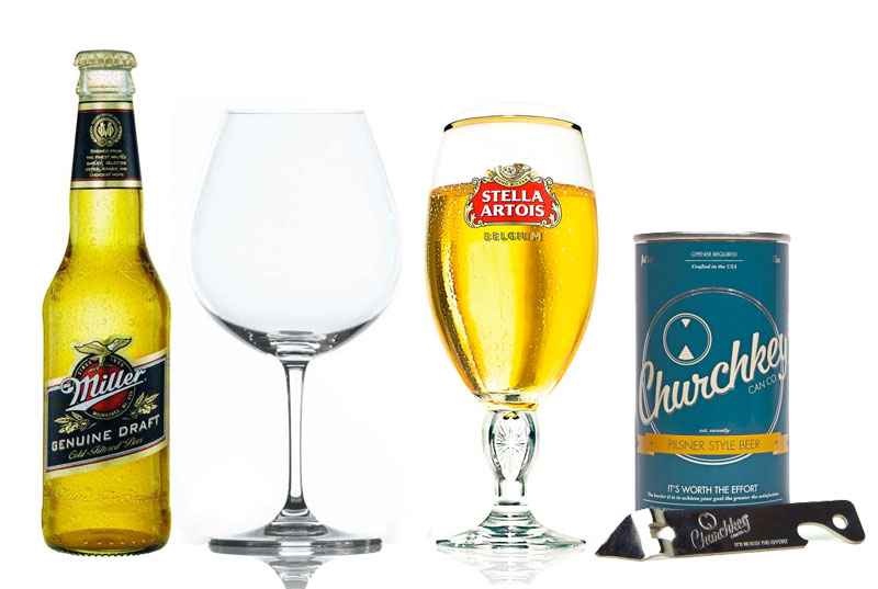
This doesn’t mean your visual design should be fancy or slick or nice. What’s right for wine isn’t right for everything. Beer doesn’t taste better out of a wine glass. You drink Miller straight out of the longneck. Stella Artois has made a whole advertising campaign of its signature glass. Churchkey is reviving a line of working man’s beer in 1940’s cans. Miller is for working men, Stella is for working men who wish they were hipsters, Churchkey is for hipsters who wish they were working men.
It’s all about knowing who audience is. Your visual design should say to them “this is for me.”
Originally posted on The Heretic Newsletter