Spaces shape creativity: Ziba project rooms
I visited Ziba on a sunny, crisp fall day. (Yes, we do have them at least once a decade here in Portland.) One of their talented creative directors, Kai Halsinger, was generous enough to show me around the studio and talk about what makes it all work. Specifically on my mind was how their physical space influence the work they do. This building was carefully considered to support their creative process.
A little background for those unfamiliar: Ziba is an experience design firm here in Portland. If you’ve seen a recent Wacom tablet or the beautifully high-low TDK boombox, you’ve appreciated their work.
Two things stood out to me about their offices.
Emphasis on the individual contributor
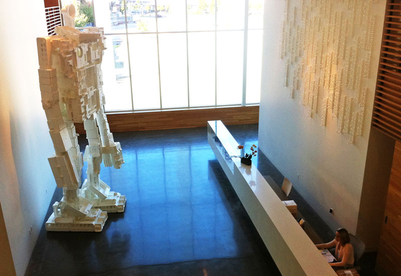
Yes, the giant roboman is awesome, but look across. Right when you walk in the lobby, the wall behind reception is covered in the names of the employees. It might seem like a small thing, that is unless you are one of the names on the wall. The list contains the current employees in chronological order of when they started to work for Ziba. The talent is really all information/innovation companies are. This might not resonate as much in non-Westerners where the highest good is to be part of a whole, but from this little girl from Arkansas, much respect.
Project rooms
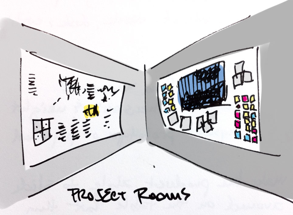
The desks at Ziba are kept deliberately small. There are no cubes. The desks are arranged into long rows. Funny thing was, almost no one was at their desk. Kai said and observation confirmed, folks spend the majority of their time inside project rooms. The uninitiated might assume it was merely a conference room where no one had bothered to clean all the stuff off the walls.
This space was organized around the core idea that the best, most creative work is done when you get people out from behind their desks into a big room. Squeezed together around a big table, people can cheat off their neighbor’s test paper, or as we call it in the professional world, cross-pollination. As they develop concepts, mockups are printed out and pinned around the room. They have giant format plotters for printing oversize documents. There are post-its from various brainstorming methodologies confettied across the walls. Whiteboards are covered in elegant scrawls.
Because the room is dedicated to a client, you never have to clear off the walls to make room for someone else. The cruft can accumulate. The importance of this not obvious at first, but is key to the creative process. You have to absorb the idea or form for at least a few days. The most important benefit of the project rooms is to never lose ideas - pin them up - and then to be able to connect previously disjointed thoughts or see new patterns that spark further ideas. This space allows time for designs to live and breathe so you can properly figure out what is working. You’ll walk in one morning and it’ll be obvious what to do next. This can’t be rushed.
Ziba generally keeps one project room per client. There may be more than one project in the room at a time. It’s a big benefit to keep the design languages consistent as each takes shape.
I also spoke to Bill DeRouchey, former Interim Director when this building was brand new. He was in their previous space as well. The project rooms there had been retrofitted into the existing footprint, not as perfectly. He said they didn’t have enough for all of the work to go in project rooms, so mockups, notes, cruft flowed out into the halls. Some of the best insights were from someone not assigned to that client randomly walking by and stopping to take a look. It’s an open question whether the serendipity from this imperfection is worth more than the clean beauty and efficiency of the current space.
Kai said clients make great effort and take great pleasure in coming to work in “their” project rooms with the creative teams. I asked how they extended the experience when clients aren’t able to travel on a regular basis. Not surprisingly, they’ve cooked up a clever solution. There is a panoramic camera that takes a 360 degree shot so they can pan and zoom around and see how things are morphing.
I hope to steal this trick and the project room concept for Mozilla. Project rooms are by no means a shocking new idea for agencies. They’ve been using them for years. I’m writing this to bring it to light so that engineering-driven companies who have in-house design groups like Mozilla can steal this idea. Designers’ needs are distinct from developers and not so obvious.
The key bits are
- expansive whiteboards
- pinboards
- post-its
- a way of printing things out in large format
- a large conference table in the middle
- a great team that constantly curates the room and evolves the vision
All in all, Ziba is an inspiring, beautiful place filled with unnecessarily clever (ok, maybe necessarily clever) people. I suspect it’s a wonderful space to come to every day.

