Pixel pushing on noms.in
Since we got some noms.in press lately with kinds words about the design, Ryan Snyder asked me to write up a few words about some of my design decisions. My first reaction is, there’s nothing to the design. I didn’t do much. I just kept it clean and let the images speak for themselves. But, I realize this is selling myself a little short. I’ve been doing design for a decade now so doing this design felt pretty effortless, but that doesn’t mean things I take for granted are obvious.
I kept all the edges square. There are no gradients, no drop shadows. It’s flat white with black text. Plain, plain, plain, just the way I like it. The links are a yummy paprika red mostly because I’m just sick to death of all this lime and turquoise smeared across everything web 2.0. I get irrationally upset about colors.
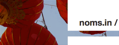
A giant part of the feel of the site is from the full screen background images. Each city has their own background. These are very important, so I hand pick each one. It’s a bit of a challenge to find the right image because the whole center of the image is obscured by the center column. This knocks out 97% of pictures since most photographers put the interesting bit in the middle of the frame.
The other criteria is that the picture needs to be one that only could’ve been taken in that city. There are tons of beautiful shots of farmer’s markets, but they mostly look the same from one city from the next. I shy away from most skylines because, although distinctive, they feel opposite of what noms.in is all about. It’s not about the whole, all-encompassing picture, it’s the nooks and crannies that we cherish.
I overlaid a 1px repeating gray square over the whole background. This serves two purposes. First, it helps to unify the look of the site from one city to the next. Even though it’s a wholly different image, the dot pattern adds a ton of consistency. It also helps to soften back the image so that it recedes and the content can shine forward.
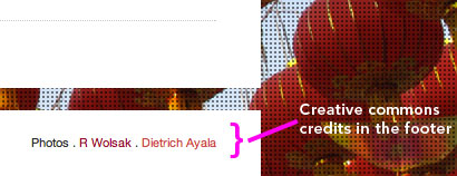
The last unique bit is that all of our images are sourced from Flickr. We mostly rely on the largess of the internet for fantastic pictures of the spots we feature. Occasionally, there’s nothing that’s suitable and we ask a curator to go take some shots. We only use Creative Commons Commercial licensed images and have built the site to automatically add the credits to each page. I work with some pretty slick developers!

